Mobile SEO is when your website has mobile friendly responsive design, loading fast, has small download size and provides great user experience by helping them complete conversion easily. It should be in your overall optimization strategy.
Websites accessed more on mobile devices than computers. Because there are more smartphones and it is always with us. We can always access the internet and learn new things every moment while traveling to work or waiting in our day to day life. Most of us do not even need a computer if our work or education is not relying on it.
For this reason we need to optimize our website for mobile and desktop devices. By optimizing for both devices we optimize our website for search engines as well. Because they also care about users who access our website on mobile and desktop.
In this article you will learn:
- How to optimize your website for mobile phones?
- Which themes and plugins to use
- Optimize images and other files
- Check if your website mobile friendly
Mobile phones with big screens have been with us for years. Over this period internet technology also developed and popular site builders like WordPress have many solutions to make your website mobile friendly.
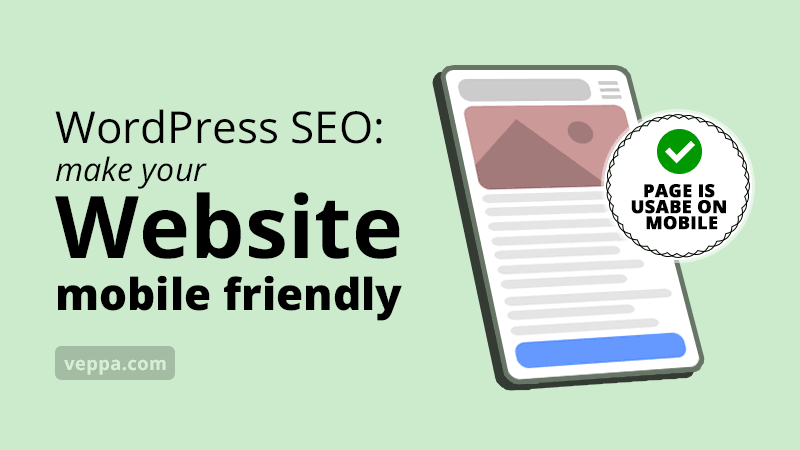
Table of Contents
How to make your website mobile friendly?
There are 2 ways to extend your WordPress website. They are themes and plugins. Both of them can be used to make your website mobile friendly.
Use responsive WordPress themes
Themes are a preferred way for making mobile friendly websites. Because themes are responsible for the design of your website.
What is a responsive theme?
Responsive theme adapts your website to different screens width for giving best experience on mobile and desktop devices. This means the website will fit to widescreen on desktop devices and fit to small screen on mobile devices. Text font size, images, navigation elements will adapt accordingly. Some page elements will be hidden or shown depending on device type.
There are many responsive WordPress themes that will make your website mobile friendly. Here are the most popular of those themes.
Responsive mobile friendly themes are not our only goal. We want a flexible theme that has features to hide or change the order of page elements. We want full flexibility to manage appearance of tags, categories, dates, author links, featured images, article snippets in posts and category listings. Removing not necessary links in our theme will help enforce pyramid site structure for our website for further search engine optimization.
Also theme assets like CSS, JavaScript, Fonts, Icons, decorative graphics, backgrounds need to be small in size and optimized for speed requiring less CPU power on user devices. All this matters for making your WordPress website mobile friendly, use less mobile data and run fast on mobile devices for every user. Good responsive mobile theme will help to reduce bounce rate.
Now let’s check the most popular responsive and flexible WordPress themes that will optimize your website for users and search engines.
1. Neve
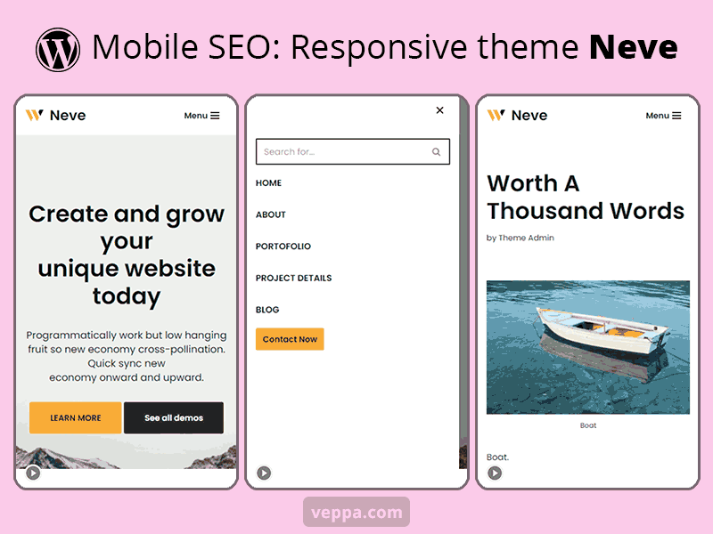
Responsive theme with component customization for posts. You can reorder or hide post details like date, use last modified date, category, tags, author, author avatar, title, featured image, excerpt. Ability to remove certain elements like author link, category link, previous-next post links will help you enforce pyramid site structure.
Neve theme uses vanilla JavaScript that makes it very fast. It does not rely on the slow jQuery library. For additional speed you can customize themes with system fonts instead of slow external forts.
Theme comes with a custom mobile menu which can be adjusted separately from the desktop menu. You can add a search button and use an overlay search form that looks great on mobile and desktop devices.
Custom widget areas on the sidebar and 3 layer footer gives plenty of customization for your widgets and additional navigation.
Pros:
- Optimized code for small size and fast site load
- Page customization with ability to remove or reorder post components.
- Several ready to use website header designs.
- Has a separate plugin for using starter sites with designed content pages for different industries. This helps to quickly build a website for small businesses.
Cons:
- Non removable copyright footer link. (was editable and removable before Neve theme version 3.3.x. now you can remove it in the pro version only.)
- Cannot adjust previous next links to stay within the parent category.
Neve theme has free (300.000+ active installations, 5 star rating) and premium (starts at 69$/year) version.
I am currently using neve theme on this blog.
2. Astra
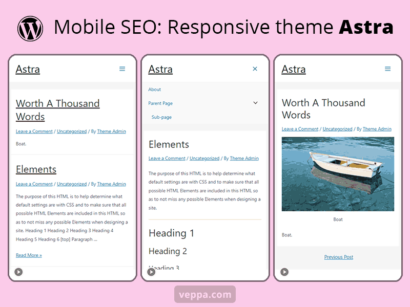
Astra theme for WordPress is responsive theme with much more flexibility in terms of page customization. You can start with 150+ starter site designs and customize further for your liking. It is lightweight which is optimized for mobile devices.
Pros:
- Multipurpose theme. You can use the same theme for different types of businesses.
- Lightweight theme.
- Plenty of customization for page elements. Hide or reorder post components as you like.
- Has the option to remove or modify footer credit.
Cons:
- Too many customization options can be overwhelming for starters.
- Default font type and size is not the best option which means you cannot use it without customization.
- Demo is not very attractive and hides the great potential of the theme.
Astra WordPress theme has free version (1 million + active installations, 5 star rating) and premium version (starts at 59$/year).
3. Twentytwenty
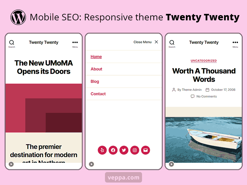
This is the default theme released in 2020 by the WordPress team. It is optimized for mobile devices. Fast theme with bold design.
Pros:
- Fast lightweight theme optimized for mobile devices.
- Background color customization with automated text color calculation for bigger contrast and readability.
Cons:
- No reordering or hiding post components.
- Only standard theme customization options. No structural theme customization.
Most of the WordPress default themes are well designed but have very little customization options. Sites using them will look similar to each other. Themes built in the last 5 years are generally mobile friendly and optimized for speed.
If you are using one of the default WordPress themes and created your website recently then it is most likely your website is already optimized for mobile devices.
Twenty Twenty WordPress theme has a free version only with 700.000+ active installations and 4.5 star rating.
4. More responsive themes
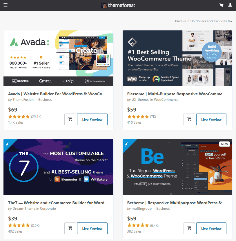
If you are looking for premium multipurpose mobile ready themes with more customization options then check Themeforest marketplace.
It has premium WordPress themes with prices ranging from 30-70 $. Additionally theme authors provide free initial support for 3 months which can be extended for additional payment. Pay attention to theme reviews and number of sales before purchasing the theme. This way you will make sure that theme is really worth the money you pay.
Avada, Flatsome, The7, Betheme are among popular themes at Themeforest marketplace.
Purchase premium WordPress themes from Themeforest →
What about using plugins for making websites mobile friendly?
WordPress plugins are an old way of making your website mobile friendly. Currently it is more convenient and preferred using responsive themes for making your website mobile friendly and optimized for search engines. Because google indexes your website with mobile first crawler and expects your website to look similar on both mobile and desktop devices. Which can be achieved with responsive WordPress themes as explained above.
In the past (between 2010-2020) there were 2 different ways to make a mobile friendly website in WordPress with plugins.
- Plugin to display simplified mobile themes only for mobile devices (similar to WPtouch) . Two different versions of your website will be served depending on user agent sent by mobile devices.
- AMP plugins are also old way of adding mobile functionality with big challenges. It will create a separate version of your website with removed JavaScript and ads. As of 2021 most internet services and mobile browsers started preferring regular website versions instead of AMP. Google also removed some features that were preferring AMP pages. This is because internet technology is advanced to load responsive websites fast on mobile devices and websites are getting better optimized for speed.
These plugins still exist, probably for serving the existing clients.
I recommend using responsive themes for making your website mobile friendly as explained above.
Optimize website for speed on mobile devices
After fixing the appearance of your website with responsive themes and showing a single page for mobile and desktop devices it is time to make sure that your website loads fast on all mobile devices. Remember that there are people with slow mobile devices or slow mobile networks. To make sure that your website loads fast on all mobile devices, always optimize images, remove unnecessary plugins, remove unnecessary JavaScript code from your website.
Compress and Optimize images
Images should always be compressed, resized and formatted with the right format for loading fast on mobile devices. Here are general tips for optimizing images on your website.
- Use PNG for text and graphical images.
- Use JPG for photos with multiple colors.
- Keep each image size below 50kb.
- Always use lazy loading for images.
- Write a descriptive alt text for each image.
Prefer optimizing images before uploading to your WordPress website. If you want to compress existing images that were not optimized previously then use image compression plugins.
Learn more about image optimization for SEO →
Review and optimize JavaScript and CSS files
Websites built with WordPress can quickly become bloated with many plugins. Some of those plugins are necessary while others add very little to your website in terms of conversion. Almost every plugin adds some code to the back end and front end which in return slows down your website. To avoid becoming slow on mobile devices, review JavaScript and CSS files added by those plugins to your website.
Follow best practices to reduce unnecessary JavaScript and CSS files:
- Check your website for page speed and detect slow JavaScript and CSS. Remove if related plugins are not necessary.
- Avoid using plugins and widgets with following criteria:
- Big JavaScript code like carousels.
- External code like page view counters.
- External sharing buttons (prefer switching to fast inline alternative).
- External or custom fonts.
- Restrict JavaScript code to related pages only. For example code for a contact form page may appear on all pages and slow down them if not removed selectively.
Learn more from complete tutorial about WordPress Performance Optimization →
Convert your website to PWA

PWA (Progressive Web Application) converts your website to an installable web application. “Super Progressive Web Apps” plugin will add PWA functionality like caching, “install as app” prompt, color and icon customization for your website application.
The PWA app is not listed in app stores (Google play or apple store) but instead it will be available to users who visit your website. It can be installed on iPhone, android and windows devices.
Once installed on a user device it will be available as a stand alone application. When clicked it will open your website as an application.
Here are benefits of using PWA for your WordPress website:
- Can be installed to all supported devices. (iOS, android, windows)
- Standalone application with icon in device app drawer.
- No need to submit to the app store.
- App installation is suggested to users who visit your website. This means they already know you and are more likely to install your application.
- Faster caching for static assets.
- Users can view cached pages when the device is offline.
- Caching and offline mode will be used even if it is not installed as a mobile application.
Get Super Progressive Web Apps plugin →
Check if your website mobile friendly
While designing your website you can quickly view how it will look on small mobile screen by resizing your browser window on your desktop computer. You responsive website will shrink and adjust its contents to fit small browser window. You will see how your website will be shown on mobile device.
To check how your website will look on google mobile crawler and make sure that all of your pages has no issues in mobile devices over time it is better to use special tools.
Use the following tools to make sure that your website is mobile friendly.
Use Google Search Console to view mobile usability of all pages on your website
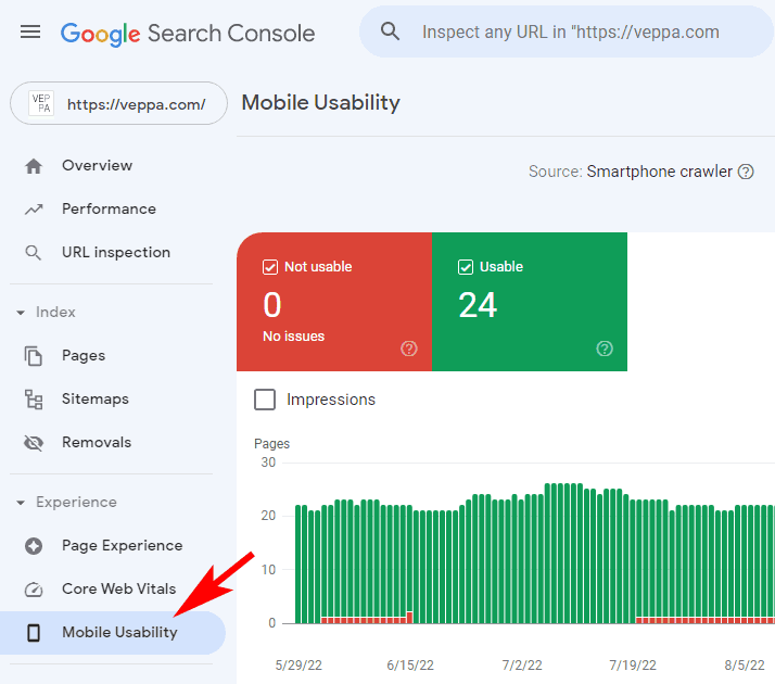
Google provides mobile usability report inside Search Console for your verified website. It will show if there are any issues detected while visiting your website with google “Smartphone crawler”.
Mobile usability report is helpful to detect any new issues that may appear after updating themes or plugins on your WordPress website. Issues like “Clickable elements too close together” or “Content wider than screen” may appear in mobile usability reports. Check reported pages and fix corresponding issues to provide the best user experience.
Check any page with Mobile-Friendly Test
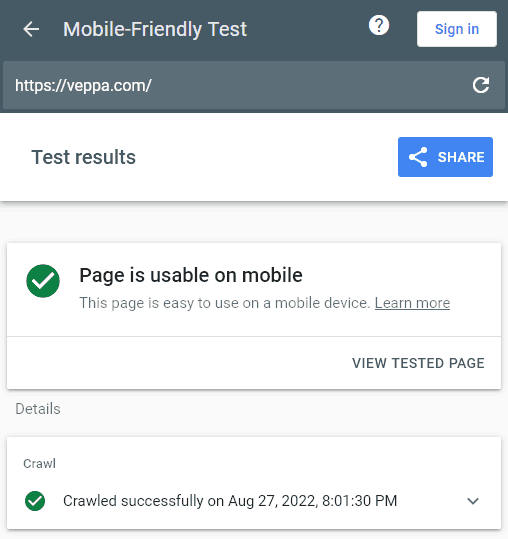
You can test any web page on the internet using the Mobile-Friendly Test tool provided by Google. Tool will access the provided page with its own mobile web crawler and show a green check-mark if it is mobile friendly. You can also view the screenshot and HTML code of the page by clicking the “View Tested Page” button.
Mobile-Friendly Test can be used to check any website as opposed to Search Console where you can check pages of your own websites only.
FAQ
Why is mobile SEO important?
Mobile SEO ensures that your website is accessible and easy to use on any device mobile, tablet and desktop. When your website is optimized for mobile devices then it will load fast, show all important information, have readable text, optimized for viewing on small screen images and clickable elements like buttons and links. Users are more likely to use and learn from your website, recommend to their friends and visit again when needed.
Why is it important to provide a good user experience for mobile devices?
Because more users access the internet using mobile devices. Google wants to make people happy by showing best results that provide a good user experience on any device. From an SEO perspective it is important to present information on your web page in a mobile friendly way as Google also uses mobile first index for indexing your website.
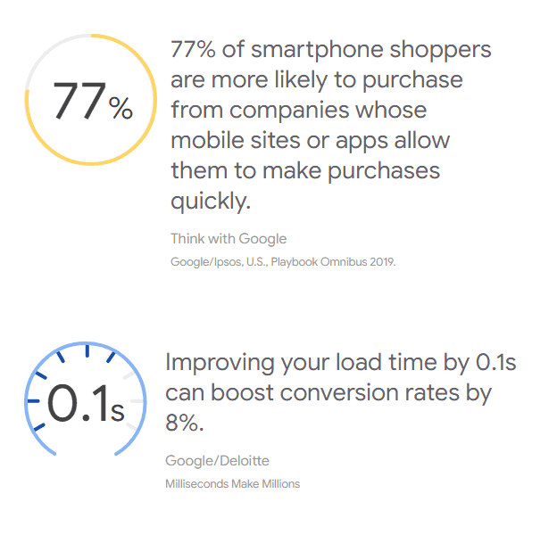
Mobile site usability and speed is important for conversion. Via google and deloitte [pdf] report.
What is better a theme or a plugin for making a mobile friendly website with WordPress?
Responsive WordPress themes are a preferred way of making your website mobile friendly. With responsive themes you will have one version of your website that adapts to any device. In addition to using responsive themes you can use plugins to complement mobile SEO. Plugins will help to compress images, convert your website to PWA (Progressive Web Application), reduce and compress website assets like JavaScript and CSS. All these will reduce download size for your website and speed it up on all devices including mobiles. Optimizing for speed is especially important for mobile devices because of slow and expensive mobile internet packages.
Conclusion
We learned how and why to make your website mobile friendly. Here are recap of important steps for mobile SEO:
- Use responsive themes for serving the same version of your website on all devices.
- Further optimize your website for smaller size and faster load speed using WordPress plugins.
- Monitor mobile usability report using Google Search Console.
- Switch to faster WordPress hosting when needed.
It is pleasant to visit fast and optimized websites on smartphones. You can always learn and complete important tasks on mobile while waiting or traveling.
For getting more visitors and converting them to regular happy customers make sure your website is optimized for mobile devices.
Learn more SEO optimization for WordPress with this beginner guide →